
+6
Better distinguishable icons for "untracked" and "added" states
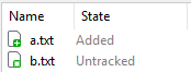
The new icons in SmartGit 26 for "untracked" and "added" states are very similar in color and shape, which makes it hard to distinguish between those states. This is especially an issue in the working tree view, where both icons are mixed.
It would be better if the untracked icon had a different color than green (it previously was blue in SmartGit 25), since this would help to see the state at once without paying attention to the exact shade of green or the additional white pixels between the star and plus icon.
Customer support service by UserEcho

You may consider selecting View | Separate Working Tree and Index. Then these files occur in separate lists.
This might be a work around, but does not solve the inherent shortcoming regarding the icon choice. Especially on screens with low resolution, splitting the working tree into yet another pane takes room I'd rather use e.g. for the diff viewer.
I think this should be a case where form follows function. The previous versions of SmartGit had better icons. While even back then, there was room for improvement, it was much easier to see at a glance which files were added and which files were untracked.
This is the main idea of an icon: To be so easy to recognize that the user does not have to read the text. If reading the text is faster or clearer, the icon becomes sort of pointless.
I also don't get why the status modifiers of symbols need to be so small. SmartGit is not like TortoiseGit where those modifiers are superimposed upon the normal icon the OS uses for this file type. The white part of the file/sheet symbol adds very little information (apart from becoming red on unadded modifications). It would be OK to increase the plus / star icon size by 30% without covering too much of the white/red sheet symbol.
SmartGit 25.1 icons
I like to second this.
In the following image, please try to quickly tell whether there are some untracked files:
I only see lots of green.
You can activate the split view for staged files which make unstaged changes extremely easy to see. Alternatively, you can sort the files by state, then the untracked files become easier to spot.