
+4
Files view: better differentiation between "Modified" and "Staged Modified" icons
Currently, it's easy to miss the difference between "Modified" and "Staged Modified" icons:
between "Modified" and "Staged Modified" icons
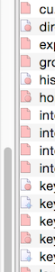
Adding a stronger outline to the "Staged" circle, or pulling the "Staged" circle a couple of pixels to the right, would really help.
Customer support service by UserEcho

What modification do you suggest?
Adding a stronger outline to the "Staged" circle, or pulling the "Staged" circle a couple of pixels to the right, would really help.
This is all subjective, but my suggestion would be something similar to what you have now but with more contrast and possibly a "+" next to it to indicate additional changes beyond what is staged.
Here's a rough mockup:
I like that the current system uses the same color for all of the "Something Changed" indicators; I wouldn't want to change that. I also happen to like the gentle red. (But, I'm no visual designer, and as you say it's all subjective...)
I like the idea of using a different color, maybe a green checkmark for staged changes?
You use the color red all over the place to indicate that "There've been changes" (e.g. in the "Staged" indicator, in the "Modified" indicator, and in the whole file list when there are changed files but they've all been hidden by the various display flags). That's a nice consistency which I wouldn't want to lose.
How about this, with a slightly stronger circle around the "Changes Staged" indicator?