Your comments
Thx for the proposal, but when you have a large list of files this is worse as you need to scroll a lot to select the files :(
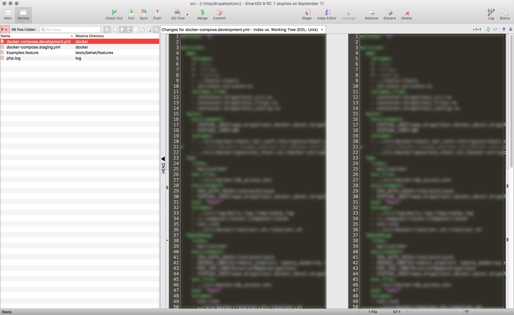
Here is a screenshot of what Smartgit looks like in full screen. As you can spot, the file selection in larger than each review pane...

I am running SmartGit on Mac OS X. I don't understand what you mean by "a dark theme", I use indeed the "dark" menu. Here is what Smartgit looks like: https://db.tt/Bcdiekvo
Customer support service by UserEcho


@ThomasSinger are your talking to me ? I am running OSX El Capitan with Dark color mode enabled and I would expect that the full interface of smartgit switch to a dark theme not only the comparison windows.