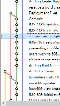
"Pin" branches to the left in the log.
Update: If you want to explicitly specify the sort order of branches, vote for https://smartgit.userecho.com/topics/833.
In a typical workflow, I develop on a "Sprint" branch, merge code into a "Test" branch, followed by a merge into a "Production" branch. However, the ordering of commits in SmartGit can make it challenging to see exactly where my Test/Prod branches were merged. Further, it can be challenging to see if a certain commit has made it live.
I have photoshopped a sample (below) of my log to describe the desired end-case. In this example, the "Production" branch has been pinned to the left, and was randomly chosen to be yellow. The Test branch has been pinned second to the left in red. The Sprint branch has been pinned as the third branch is in Green.
All other commits on un-pinned branches revert to the display logic that currently exists in Smart-Git

Customer support service by UserEcho


Great idea.
Personally I found myself confused with the left-side little graph so many times that I started ignoring it altogether.
In Git a branch is nothing else than a named pointer to a commit. The commits themselves don't have any branch information. With that information how do you think this request could be implemented?
Beside that, SmartGit always lays out the log history structure starting from the top. Hence the top-most visible commit is always left-most. This is a rather complex algorithm to keep the width as narrow as possible even for large and complex repositories.
AFAIU, this topic comprises two different issues:
(1) Sort order of the branches: which branch should be further left (relative to others)
(2) Straight connectors
I think it's possible to address (1) with reasonable effort, because we already do something similar for Git-Flow. Regarding (2), as Thomas has pointed out, the minimum-width, shift-to-left layouting is a very fundamental mechanism and won't be easy to change and would likely cause other drawbacks.
Here is a (simple) instance where SmartGit log is misleading, and where Source Tree is more readable.
Is this repository public, so I can reproduce the problem?
I just put this example on GitLab, tell me if you cannot access it.
(The problem is apparent when looking at all the 3 branches in the Log.)
https://gitlab.com/jonmerel/SmartGit-193
Thanks, I can access the test repository, however the graph looks fine for me. Do you have system property "smartgit.log.graph.layoutActions" set and do you have modified the Max. Connector Length? If so, please send your settings.xml directly to smartgit@syntevo.com
The graph you obtained is the same I got. The graph is "correct" but difficult to read because 3 branches are shown as 2 ("shift-to-left layouting").
Thomas Singer mentions: "this is a rather complex algorithm to keep the width as narrow as possible even for large and complex repositories".
I would prefer wide readable graph rather than narrow difficult-to-read ones.
Maybe make this an option ("compressed graph" on/off)?
"On the bottom Master is green, but changes to red at the top." This statement is wrong from the Git perspective, because master only is pointing now at the commit q. The commits a-h don't have anything todo with the named pointer "master". They could have been created with any branch, e.g. foobar, - this information is not stored in Git.
I still agree with Jonathan: when following first parents commits of master down the Log, the color should be preserved as long as possible. For the specific example, red color is preserved for the merge source instead of the primary parent. That should be changed.
I have just uploaded 17.1 preview build 11069 which comes with two improvements:
- in certain situations, parent colors are better preserved (requires Git-Flow to be enabled, so SmartGit will know that "develop" is more important than e.g. "features/foo")
- with system property smartgit.log.graph.layoutActions=true set, the graph context menu provides a new option to Toggle Preserve Parent Order (for which effects may be more frequent/visible if Git-Flow is disabled)
The result is much better with this option. Could "Preserve Parent Order" also "preserve parent color"?
Have you enabled Git-Flow (Light) and configured "master" as your develop-branch?
We don't use Git-Flow yet, our repo was imported from SVN and we have a great number of branches.
I think I have somewhat diverted the original issue intent.
In any case, I am happy with the graph obtained with "Toogle preserve parent" and a large number of "Increase rectilinearity".
Theses two options should be more visible, maybe in the same combo box or beside the branch colouring.
Thanks for your answers.
SmartGit 18.2 preview build (13104+) contains a new low-level property (Preferences, Low-level properties):
Which in combination with:
yields graphs very similar to other Git clients. This should at least partially obsolete this request. If you want to explicitly specify the display order of graph branches, vote for https://smartgit.userecho.com/topics/833.