Your comments
Branching-Graph - Description of my 2nd post.
I think we should rename the Idea. It's not only about horizontal-vertical, but more about the presentation of the information.
Why do lots of GIT branching papers use a horizontal layout? I think because it's more intuitive and compact (because text is naturally drawn horizontally).
Look at this one:
This is also a great overview. But I think this requires more space and therefore also more scrolling and less overview.
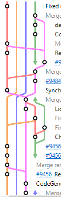
For me, sometimes, the top-down log shows too much information on the screen. I can get all data out of it, but I need some time to do so.
We branch a lot (using gitflow full) and do not make use of rebase. So, the more we go back in history, the more branches are visible. For me, it takes a lot of time, scrolling and clicks to get an overview:
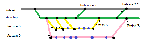
Sometimes, I'd like to get a quick overview about the branches / merges. I think of something like shown below.
Maybe both logs are shown side by side and if you select a commit in the detail log, you can see the position of the commit in the overview log.
Horizontal alignment has the advantage, that we can see a much longer time range and more branches at once.
Customer support service by UserEcho


This is 100% what I have in mind.
Thank you for this link.