Share your ideas on how to improve SmartGit!
This is no support platform! To report bugs or request support, please contact us directly. If in doubt ask us.
First search for a similar request and add your votes or comments there.
Take the time to describe your request as precisely as possible, so users will understand what you want. Please note that we appreciate your time and input, but we don't give any guarantees that a certain feature will be implemented. Usually, a minimum requirement is a sufficient number of votes. Hence, please don't comment like "when will this be implemented", but vote instead.
Follow the stackoverflow.com writing guidelines.
Thank you for your help!

Changes view: support for external tools accepting file and line number
I want to jump from the Changes view to an external tool at that line. Need some way to get the line number to the external tool.
Group discussion about why:
https://groups.google.com/g/smartgit/c/TXuFWUypP7w/m/2DxzwxsuCAAJ

Worktrees: Create from right-click on branch
The workflow to add a worktree could be way simpler and faster.
Just right-click a branch → Add Worktree.
The current way, via the Repositories menu, feels like a clunky afterthought.

Cross-Repository File Copy -- Direct Transfer Between Local Repos
Current-workflow: copy-file → leave-SmartGit → file-manager-navigation → find-target-repo-directory → paste → return-to-SmartGit → stage-changes. Friction-heavy.
Proposed-feature: right-click-file → Copy-to-Repository → dropdown-shows-all-local-repos → select-target + choose-destination-path → automatic-transfer.
Result: file-copied-to-target-repo (new-file, no-history-attached) -- source-repo-unchanged, history-preserved.
Use-cases:
- config-file-sharing across projects (eslint, prettier, workflows)
- component-migration between codebases
- template-distribution to multiple repos
- cross-project-asset-syncing
Benefit: workflow-stays-in-SmartGit → no context-switching → faster-iterations → cleaner-mental-model
Current-workaround: terminal-cp-commands OR file-manager-juggling -- both break-flow.
This-feature → treats-repos-as-connected-workspace rather than isolated-silos.

Conflict Resolver: another view on conflicts
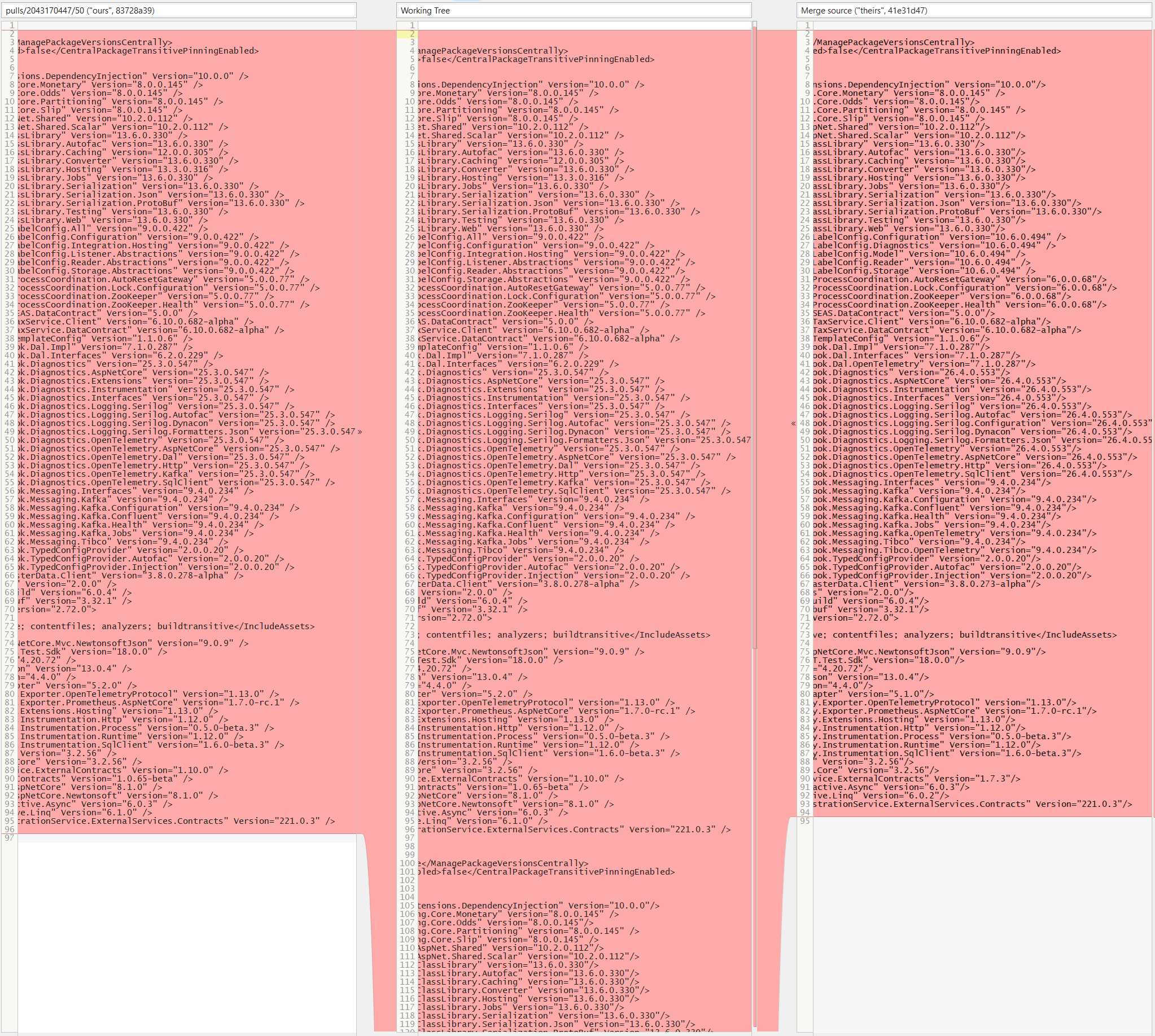
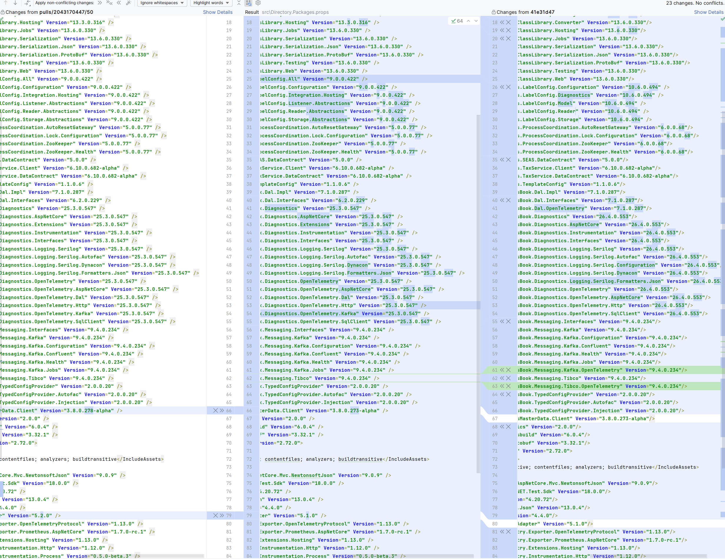
The only thing that i find often inconvenient in SmartGit - the way conflicts are displayed and handled in Conflict Resolver.
SmartGit view:

JetBrains GitClient view:

The later has much more clear (and less scaring :) LOL) picture of the conflicts.
Would be perfect if we are able to switch to yet another view on the conflicts that would be similar to the one on the second screenshot!
Thank you!

File filter: searching a file by name should only find filtered files
In the file table, it could be great if the "filter by name" feature only would consider files visible without typing anything, not all files.
for instance if I want to see all .vhd modified file, I can unselect "unchanged files", and search for .vhd files.
currently smartgit will display all .vhd files even those that are "unchanged" whereas the "unchanged" button filter is activated.

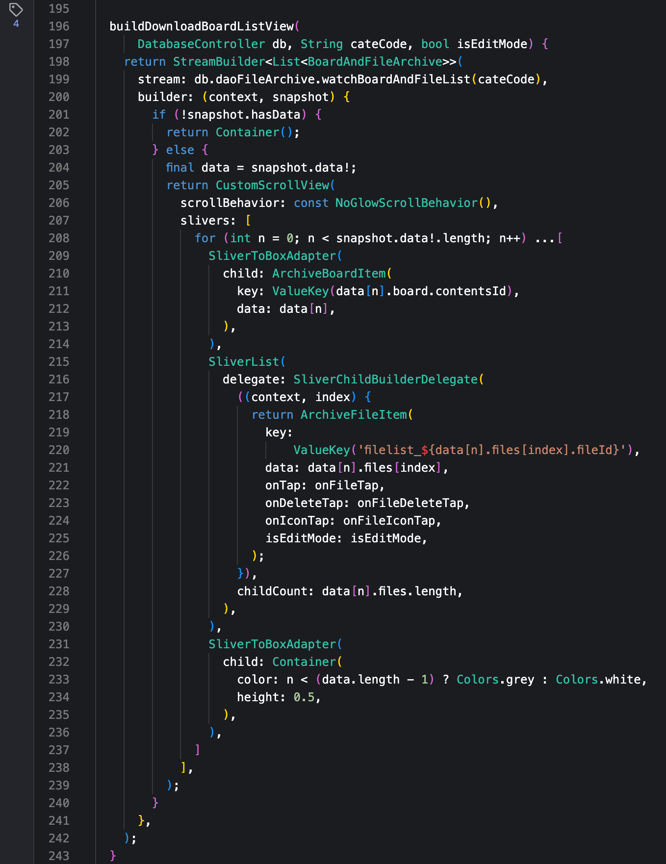
code file diff in bracket pair colorizer
If bracket pair colorizer is supported, it will be easier to analyze nested parentheses when comparing and reviewing files.
JetBrains IDE supports it as a plugin, and Visual Studio and Visual Studio Code also support it natively.
And it is also supported by GitKraken, a market competitor.
If this is supported, analysis will be much faster in file difference comparison.
The screenshot below shows the bracket pair colorizer supported by Gitkraken.

The bracket pair colorizer is supported in JetBrains IDEs if the following plug-in is installed.

Changes view: Remember "Ignore Whitespace"
Please bring back the persistent "Ignore Whitespace" toggle. Since some build of 24.1, the "Ignore Whitespace" option resets every time I switch files, and I have to re-choose it constantly.
I spend a lot of time just viewing my working tree changes, and staging/unstaging hunks. Viewing significant code changes without the noise of whitespace deltas is important.
Therefore, I really want my viewing preference to persist. The new "Ignore WS" button is a welcome improvement, having it's state visible, and togglable with one click. (I would similarly welcome a "Ignore EOL" button 🙂). But constantly having to re-instate my preference, even just switching to another file then back, is tiresome.

Branches View: quick-search should support paste from clipboard and standard text editing features
I found a very very strong drawback in your "Search for" form (appears not by hotkey or menu, but automatically as you type) in "Branches" View.
This form is absolutely incompatible with copy-paste!
Just try to find branch in "Branches" view using "Search for" and pasting required text from clipboard.
I tried several ways to workaround this strange behavior but everything did no work well.
If you type branch name manually - it works OK.
If you try to paste branch name or even part of branch name - it does NOT work.
Besides incompatibility of "Search for" with copy-paste from clipboard - it's also incompatible with standard text editing (for example, try to use left and right arrows to navigate in search text and edit it - your panel just disappears automatically).
My recommendation: allow user to make "Search for" permanent or show/hide it by explicit user request (not automatically - this works badly!) - at least it should NOT auto-destruct if I edit search text using standard text editing and it should work with copy-paste from clipboard.

Allow "Move to" context menu to be hierarchical to match Repositories groups
We use nested groups to great effect in the Repositories view to manage our all our projects, often consisting of 100+ repos each. To arrange the repos in these groups we can either drag and drop into the group or use the context menu and choose "Move To".
With a hundred repos in a group dragging repos to another group does not work (in the past it would scroll slowly if you moved to the top/bottom of the view but this no longer appears to work) so we now use the context menu. The issue with the context menu is that it is a flat representation of all the groups. There are up/down arrows at the top of the context sub-menu but these only adjust the menu one line at a time which is also very slow.
My feature request is to make the "Move to" menu follow the same hierarchy as the groups in the Repositories view, using sub-menus rather than just spaces. This could be an optional feature enabled in config to not break other customers' workflows.
Some stats about my setup:
Number of repos managed by SmartGit: ~2800
Number of groups defined: ~210 (42 level 1, 146 level 2, 22 level 3)
SmartGit Details
Version: 23.1.3 #20195
Java version: 17.0.5+8-LTS (c:\program files\smartgit\jre)
Windows version: Microsoft Windows [Version 10.0.19045.4412]
Customer support service by UserEcho


