Your comments
You may try setting the low-level property "completion.useAltAsModifier" to true. Maybe that helps for your use-case.
Will be fixed in 26.2.
What operating system you are using, what system theme (light/dark)? Do you mean the auto-light/dark theme in SmartGit or the forced dark theme?
What exactly is hard to distinguish for you which was easy before? Please show an example.
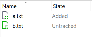
Note, there is already a related ticket: https://smartgit.userecho.com/communities/1/topics/1887-better-distinguishable-icons-for-untracked-and-added-states
What exactly is hard to read/distinguish for you?
Do you just don't like these colors (e.g. because the color choice is ugly) or do you have so problems distinguishing the icons? Which icons - the toolbar icons, or the file icons?
Would that be an improvement for you?
The Standard window's Commit view will show branches, tags and on branches information since SmartGit 26.2.
Customer support service by UserEcho


Hi Andrii, you can change the file patterns in the SmartGit preferences, page User Interface > Built-in Text Editors > Languages.