Your comments
You already can select the commits and select Copy Message in SmartGit 8.1.
Why you are not using a plain compare (F4)?
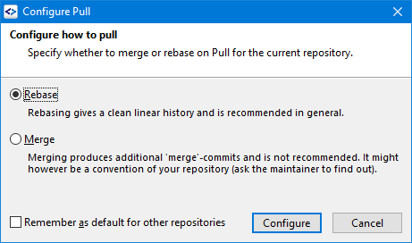
Ich mean this dialog which pops up on Pull if pull.rebase is not configured yet in the .git/config file.

If you select the "Remember"-checkbox, pull.rebase = true will be added to ~/.gitconfig and you won't see this dialog again.
SmartGit uses the native controls. Those of Gnome 3 are excessively large. Please try using a different desktop.
Please create a new request.
It's the first menu item in the left most menu of the Conflict Solver. Where did you search?
No, this checkbox should be shown on each repository where you are pulling the first time - until you select it.
Customer support service by UserEcho


Please try Help | Check for Latest Build in the SmartGit 8.1 preview