Share your ideas on how to improve SmartGit!
This is no support platform! To report bugs or request support, please contact us directly. If in doubt ask us.
First search for a similar request and add your votes or comments there.
Take the time to describe your request as precisely as possible, so users will understand what you want. Please note that we appreciate your time and input, but we don't give any guarantees that a certain feature will be implemented. Usually, a minimum requirement is a sufficient number of votes. Hence, please don't comment like "when will this be implemented", but vote instead.
Follow the stackoverflow.com writing guidelines.
Thank you for your help!

Mercurial - rename/move bookmarks
A nice to have would also be the ability to rename/move bookmarks as is possible
in TortoiseHg.

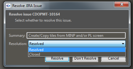
Push, JIRA: add possibility to choose custom Jira task status and resolution
It would be helpful to be able to specify custom task status in 'Resolve JIRA Issue' dialog window.
I think it would useful when custom Jira workflow used to specify other task status after push like 'Development Done' or 'Ready for Review'

Be able to create merge-commit using system git-flow
Checking "Use pre-installed ("system") Git-Flow" in preferences causes SmartGit to use "git flow ..." instead of its built in algorithms. When doing "Finish Feature", SmartGit's dialog box presents the following options:
Create merge commit
Create simple commit (squash)
Rebase onto 'develop'
If you choose "create merge commit", it passes no options to "git flow feature finish", which will do a fast-forward merge if possible. I would expect "create merge commit" to actually create a merge commit, as it does when you are using the SmartGit git-flow algorithms. It seems odd that "create merge commit" would behave drastically differently for system git-flow vs smartgit git-flow. This would require passing the "--no-ff" option to "git flow feature finish".
Perhaps the options should be the following for both system git-flow and smartgit git-flow algorithms.
Fast-forward merge (which will fail if it can't do it)
Create merge commit (which will explicitly create a merge commit even if ff-merge is possible)
Create simple commit (squash)
Rebase onto 'develop'

Reword the Check for New Version and Check for Latest Build menu items for clarity
The names of the Check for New Version... and Check for Latest Build... menu items do not make it clear what these actually do, or which one you should choose for a normal update.
A simple improvement that would make their functions much more obvious, and more consistent with other apps, would be to rename them to Check for Updates... and Check for Experimental Build...

Add toolbar button for showing staged files only
I would like see staged files only before commit. For using F6-key changes stream.


Add ability to copy tag message
It's irritating entering details for a tag, and then not effectively being able to use them later when I'm documenting release notes. I can see the details if I hover over the tag in the branches pane, but as soon as I move the cursor (e.g. to type), the rollover text disappears.

Add tabs to log window
Change the log window to contain tabs with different repo's/files' logs, instead of having multiple separate windows.
For integration of the Log window into the main window, vote for: http://smartgit.userecho.com/topics/145
Customer support service by UserEcho