Your comments
SmartGit 18.1 preview 1 will have the option to configure the times globally
You already can open, e.g. the blame for a certain file using command line parameters: http://www.syntevo.com/doc/display/SG/Command-Line+Options
You can compare any 2 commits in the log by selecting both. Here, just select the commits where develop and your feature branch point to.
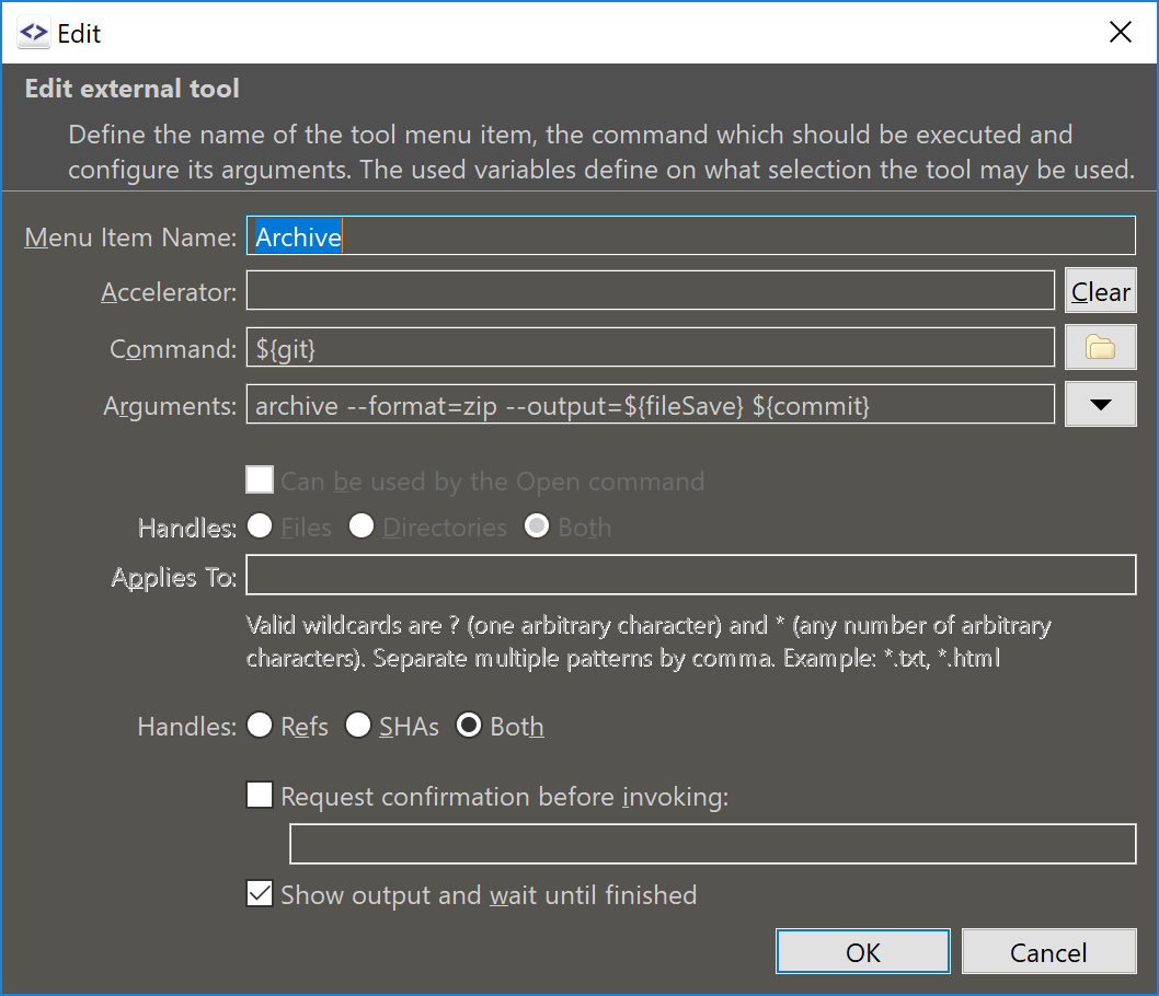
With a fixed format it could be configured like that:

What options you would need? Would an external tool be sufficient for you?
Should be available in 17.1.1.
The SWT API to set certain colors improves continuously, but does not yet allow to configure every control or part of a control.
We've did not name it "minimize", because in my opinion "minimize" means to show the tray icon only after the (last) window has been minimized. SmartGit, instead always shows a tray icon when running. Any better understandable alternatives to "nest in system tray" are welcome - "Show tray icon"?
You already can do that by closing the window. There is an option in the SmartGit preferences to "nest in the system tray".
Customer support service by UserEcho


In the preferences, page "SmartGit updates". Note, that according to the license agreement the non-commercial license, if not updated regularly, might stop working.